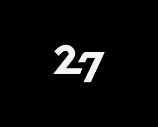
Description:
b/w
As seen on:
florisvoorveld.com
Status:
Nothing set
Viewed:
28646
Share:


Lets Discuss
I'll admit, it took the color version for me to catch it...but very clever indeed! :)
Replyaquare up that seven and it will be stronger.
Replysquare
ReplyNice one if you do what Mike suggested.
ReplyGood one! :)
ReplyNicee! :)
ReplyYes, %22aquare%22 up the 4 a bit more and it will strengthen the 4 even further, I agree. %3B)
ReplyI know, its hard to design and very easy to critique, but when I first saw this, I read 'y' instead of 4. Also, the possibility of 'S'. Nice work though :)
Replylooks very good to me, readable, good idea.
ReplyGreat idea - the 4 isn't immediately recognised, unfortunately. But once you get it, it is great.
Replyi saw it immediately. like this much better than the color version.
Replythanks people :)
ReplyThis one is great Floris, although I feel there is room for improvement...specifically with the right side of the 2.
ReplyThanks Joe, this project has reached a dead end so I won't be adjusting till someone interested comes around. Thanks though :)
ReplyThis is outstanding. I caughtit right away. Although I think it needs some sort of changes on the type but nonethless a clever design indeed.
ReplyThis is outstanding. I caughtit right away. Although I think it needs some sort of changes on the type but nonethless a clever design indeed. :)
Replyworks for me :)
ReplyThanks Thomas %26 Riz
ReplyIconic logo design. I am jealous I have not designed it %3B)
ReplyVeryyy nice. A little hard to catch onto, but very clever.**Hats off.
ReplyYou make me blush Jan :)**Thanks you Matt
Reply%5E -s (or you for that matter)
Replygreat!
ReplyThanks Brigada Creativa
ReplyCute. %3B)
ReplyThanks for your kind comments Pierro
Replyfantastic work
ReplyThank you Wladimir,**I wonder if this one is against logopond policy by the way, because it's somewhat of a symbol, but also a wordmark, but only with numbers :)
Replyand with the policy I mean if it meets the requirements for the gallery (not an open application by the way)
ReplyVery clean! Great!
ReplyBrilliant!!! Well doneeeee!!*
ReplyClean, clever and to the point, great job!
Replyand that's the logo which should be featured at the main page!!!
Replysuper clever!
Replyawesome
ReplyGreat work, clean and clever!
ReplyGreat mark. Simple and clever.
ReplyGreat man!!!
ReplyVery smart, bravo!
ReplyWOW....great use of the negative space yielding a positive design. Brilliant.
ReplyCool work! Btw. nice site update :)*
ReplyGreat use of the negative space!
ReplyThank you all very much!
ReplyWow, smart. Caught it right away. Nice one!
Replyhow to buy it ?
ReplyPlease login/signup to make a comment, registration is easy