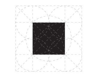
Float
(Floaters:
48 )
Description:
WIP. Behance-style geometry shows how the black square was constructed.
Status:
Work in progress
Viewed:
7359
Share:




Lets Discuss
you are giving away my secrets man!...
Replylike a real pro!
ReplyA bit more, please. A close-up of a corner perhaps?
ReplyLOL!!! Bravo. Clap clap clap.
ReplyLOL @ epsilon.
ReplyLooking forward to the final product.
ReplyHA! Brilliant. I'd like to request an obligatory DOF shot...
Replylmfao
Replyyou're missing some circles man.. it can't be that simple! :))
ReplyWell done, love your thoughts behind this. One of the best executed black squares ever!
ReplyAbsolutely spot on!
ReplyLOL...ok...ok...stop...I'm going to wet myself!
ReplyProfessional:)
ReplyCheers guys. I'll keep at it. Could be a late one.
ReplyClassic!! Nice Roy :D
ReplyI'm doing it exactly that way!
ReplyCan you demonstrate how to create a Black Circle too?
ReplyHahaha Nice one Roy!!
ReplyLOL @Mike
ReplyCareful, it looks awful close to this logo: http://www.blacksquare.com/**You wouldn't want to step on any toes. %3DP**(jk jk jk)
ReplyI think its safe, Tabitha. that person didn't even show how make a %22B%22. This way different. and cooler.*Love it. :)
ReplyThe funny thing is, when I first started, I thought I had to do that to be a pro. Behance gave me the wrong impression lol
ReplyHahaha! Awesome.
ReplyI always knew it was not so simple :D
ReplyDon't give away your trade secrets :P
ReplyMh, seems like you are missing some lines %3B)
ReplyA many of circle with a many of lines. :?
ReplyPierro, the logo is not real - it's sarcasm (a joke).
Reply@logomotive: Yeah that would be good although I may try a distressed logo next. %3B)
ReplyHahaha, damn it's hard to make a square this days, eh?
ReplyRoy, I'm not insulting, just this work must be submitted in Behance.
ReplyPierro, I know you're not but you should lighten up a bit. :)
Replyhehehe :)
ReplyLOL, I've never seen such a perfect square :)
ReplyLOL :-) go on, this going to be a perfect shape.
ReplyI'm aware of everything, no need to say.
Replyall your radii are belong to us
Reply:D this reminds me of my 7th grade Geometry assignments :). Nicely done but as someone said... you should not reveal your secrets :D
Replylol
ReplyOh that's Classic. Bout time.
ReplyI love you.
ReplyNice, Roy! The tips are excellent %23%23%23 hahah! :))
ReplyI love the ridiculousness of this. :D
ReplyHaven't seen anything similar but still took the liberty and did a quick search for ya Roy. I think you're safe.
ReplyThanks but why is this in the gallery? LOL
ReplyIt is a demonstration of the engineering of shape. The balance of form, the profound mechanics of pixel...
ReplyThis is a total ripoff of Kazimir Malevich! Ban him for life!
ReplyYou know, I think I've seen this before.
ReplyHaha, cheers gents for the humorous comments
Replyhaha. Make a circle next.
ReplyAmazing
ReplyYou should include fancy photographs that zoom in at crazy angles and dramatic lighting.
ReplyI think this is how they made Mickey Mouse.
Replylol my father was the manager of the Contemporary Resort at Disney World and I went to Disney as often as most kids go to the local playground growing up. I've seen how they made Mickey, definitely not like this!
ReplyLooking forward to seeing this with type
Reply^ I don't think I'll have the processing power to generate the guides.
ReplyI'm still in awe of how fantastic that square came out.
ReplyYeah, thanks to the circle. You can construct anything with a circle... even a circle.
Replynow try the opposite?
ReplyHmm something is missing here..., how do you have constructed the circles before you used them to create the square?!
ReplyAlex is right. I demand some kind of explanation here Roy.
ReplyI don't want sound like one of those guys that spend their time looking for similarities on logos, but you should check this one;
Replyhttp://theblacksquarecollective.files.wordpress.com/2009/11/the-black-square-temp-logo.jpg?w=450&h=337
But well, it could be just another case of great minds thinking alike.
^ I already made the similar logo joke here 3 years ago lol
ReplySee, another case of great minds thinking alike! lol
ReplyLOL yep!
ReplyGenius, LOL :v
ReplyPlease login/signup to make a comment, registration is easy