
Description:
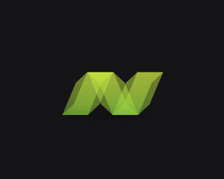
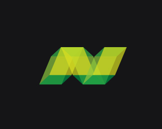
Minor changes made to the N symbol. With font.
I have recently picked up a new project for Neezy.net. Gaming Website where gamers showcase their skills (good or terrible) from a chosen and diverse list of games for XBOX live.
I wanted to go with an N symbol concept. I went with rectangles on this one to represent the shape of the XBOX and slanted them so when they overlap eachother they form both an "N" to represent "NEEZY" and two Xs to represent "XBOX".thanks.
As seen on:
neezy.net
Status:
Work in progress
Viewed:
2705
Share:

Lets Discuss
Try another version with the type running in ring around the mark. Maybe Neezy Net on top and post your experience underneath?
Replyjonnyd, that would be a really good revision to this...I can't believe I didn't even consider it...thank you
ReplyI would be interedted in seeing that revision as well.
ReplyPlease login/signup to make a comment, registration is easy