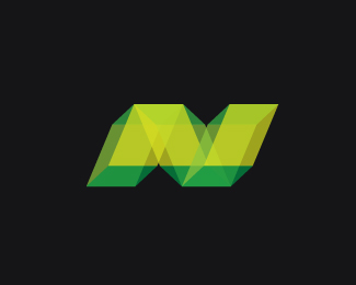
Neezy
by felro • Uploaded: May. 12 '11

Float
(Floaters:
20 )
Description:
I have recently picked up a new project for Neezy.net. Gaming Website where gamers showcase their skills (good or terrible) from a chosen and diverse list of games for XBOX live.
I wanted to go with an N symbol concept. I went with rectangles on this one to represent the shape of the XBOX and slanted them so when they overlap eachother they form both an "N" to represent "NEEZY" and two Xs to represent "XBOX".
What do you guys think of this? Feedback would be great.
Only symbol for now, thanks.
As seen on:
neezy.net
Status:
Work in progress
Viewed:
3047
Share:


Lets Discuss
feedback?
ReplyHey bud, I gotta say that I like the shape and feel of this. It will probably get applied on dark background mostly (following the XBox brand) but on the lighter one it could lost it's power a bit.
ReplyNice! Think the colours could use more contrast/saturation. If you adjust the levels in Photoshop you'll see what I mean. Really like it, Felro!
ReplyGreat modern logo.
Reply@Alen - Yes, it would ideally go on a black background, like in the website. The only way it could work on a lighter background if I changed the symbol to a black at %23000000. I should investigate a clever way to make it work on both. Thanks pal. :)**@dwd - Thank you. Yes, I will definitely try that bud. Appreciate it :)**@Simon - thanks!
ReplyStunning! No feedback required... Just let it roll!*
Replythanks jonnyd
ReplyPlease login/signup to make a comment, registration is easy