Description:
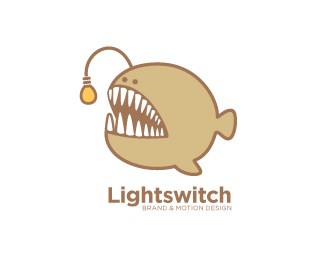
It took me a while to think of a way to present the word, "Lightswitch" interestingly. A bit too cliche, Lightswitch has so many associations that come with it—lightbulbs, lighters, switches, matchboxes and so on. So I decided to take a different route and get the light from a different source. Here it is!
The logo was designed to work on medium to larger sizes. It doesn't have to scale down extremely because the company won't use it that way anyway. It was also intentionally made to be a little friendlier than the typical sans serif logotypes that many design companies use.
Also, the company is partly dealing with motion graphics, which is why I also made the fish to be animate-able. :)
Status:
Nothing set
Viewed:
22067
Share:





Lets Discuss
Hahaha Excellent!
ReplyWow...That's clever I love it
ReplyNice bit of left-field thinking and a cool logo.
ReplyLove the big fellas personality.
ReplyThanks JMC, cerise, cseven, Brandsimplicity! I really worked hard on this one. :)
Replyhahhaha......so funny! very nice!
Replyi love this, this is freaking awesome :)
Replylol... so simple and fun.*love the perspective on the teeth
Replylove :)
Replywicked! :)))
ReplyGenius!
ReplyThis is great! cool concept! I remember that one from 'Finding Nemo' to! :)
ReplyHaha, marvellous. D:
ReplyVery clever. Way to think outside of the box.
Replyyeah i like this great job
Replynice X))
Replynice job! :)
ReplySorry won't be able to reply to everyone. But really, thanks for all the comments! :D It's an honor.
Replyque buena idea y que buena mascota, me gustaria que tuviera un color mas amigable por que se siente muy serio, pero esta genial el resultado
Replycool.. had an idea for this fish too.. but again.. nice work!
ReplyWow...this is definitely a unique approach to this brand's name...excellent work!
ReplyVery cool. Would make a great T-shit design.
ReplyHey Dwit! Great work! How much do you charge for your logo design?
ReplyLogo, logo 5 dollar!
ReplyHow can that be rentable? Who the hell wants to first of all steal other peoples work, and re-sell it. And secondly not even deliver them... For silly 5 dollars. jeez!
Replyvery nice
Replyso
ReplyPlease login/signup to make a comment, registration is easy