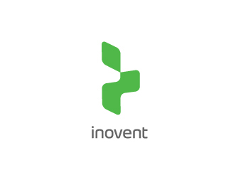
Description:
Inovent is a start-up tech company producing TVs and such. They pride themselves for innovation.
With that knowledge, I had to create a logo that would look good on tech gadgets and be in itself, innovative. Here is the one I came up with. If you don't get it, it's basically the left shadow of an isometric letter "I" with the edges curved. It's a small "inovention" of the letter I. :)
Status:
Nothing set
Viewed:
5138
Share:




Lets Discuss
Very cool - it suits its purpose well.
ReplyYep! This is cool. Maybe some other color scheme but the logo is nice, good job! :)
ReplyBingo! Great idea
Replyvery good logo/mark
Replylove
Replysimple but memorable, very nice
ReplyVery cool, took me a minute to figure it out though.
Replyreminded me immediately of this:%0D*%0D*http://resource.com/%0D*%0D*not saying you copied, i think yours plays with perspectives differently than Resource's version.
Reply@Type08 What color scheme do you think would suit this? :)**@gyui lol, it does look similar to that logo from resource! haha!**@everyone else, thank you so much!
ReplyGreat job, love it!
ReplyCool perspective.
ReplyMost of the products of that kind are black or silver in the final shape (few whites) and I was trying to imagine this logo applied there. It is a very nice mark but I just didn't feel it in green (maybe silver version on black or something like that would make it much stronger)... JMO... :)
Reply@Type08 I do agree that black or silver would look much better on tech products because they're neutral. But I'd use green for the company color, and since the mark is quite flexible, it can be converted to black/silver in the context of certain products. :) Thanks for the comment!**@Everyone else, thanks again! :)
ReplyPlease login/signup to make a comment, registration is easy