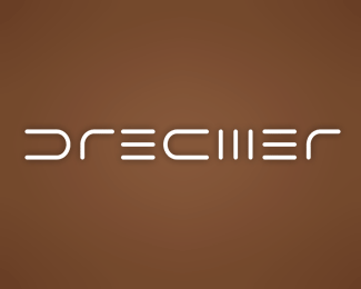
Description:
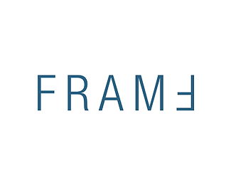
Logo for personal use, t-shirts, tags, whatever I can think of. This is mi nickname, so I thought I do something with it :)
Status:
Nothing set
Viewed:
3783
Share:

Lets Discuss
Hey Stefan, I like this!*The only concern I have about it is to what extent does the style of the symbol represent the content?*What I mean is, the style is cool but is very futuristic and technical and dreams are something a bit more more round and warm I think.*This is just a thought, I like it anyway. **: )**
ReplyThis was an abstract brainstorm, mate :))) Nothing serious and meaningfull :)) I just like how it looks almost like a barcode, so abstract - thats why I didnt delete it, it will find some use someday eventually :))
Replysmartinup, nice twist, hadn't occured to me :))
Replysmartinup is great for that kinda thing... man ive seen him post it on other logos... he has a 'smart' way of lookin at things...
Replynido, and your thoughts on this.......? :))**yeah, more like smart-it-up :PP
Replyoh sorry dude... yeah, my thoughts... well to be honest i didn really come across it till after smartipants (joke) comment, so in the light of that, i think its brilliant:) ...perhaps though you can use the 'a' reversed as the 'd' or vice versa? that way ur kinda using the same shape again as you have done a couple of times on other letters? does that make sense? wonderfull showcase though dude:)
ReplyThank you :)))))))))) You're absolutely right about the %22a%22 shape and the %22d%22 one :))))))))) I'll try it :)))**I dont know whats wrong, I update my showcase and yet I dont appear in the Updated Showcases list on the frontpage..... how come???? In the forum noone answered my question.......**Thanx again, Nido, I really appreciate it :)))))))))))
ReplyUpdated :))) Thanx, Nido, nice touch :))
ReplyHm, was a nice idea but now it looks like DRECMER.
ReplyHmm I think it's just enough for the brain to finish the word correctly and still be very abstract :))))
ReplyI think the A needs to be like an upside down U. I think this version looks like a C also
ReplyRtied that, KGB :)) Didnt look OK
ReplyTried*...... damn those late friday afternoons......
Replydrecher? dredher? drechier?
Replyhaha... is kool...i thought you might have used the 'a' as a 'd'... you did it the other way tho... **but what i dont get is how are you people makin a 'H' outa that!!! its nothin like a 'H'!
ReplyPlease login/signup to make a comment, registration is easy