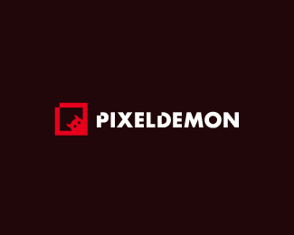
Description:
Pixeldemon.
As seen on:
Down With Design
Status:
Client work
Viewed:
10747
Share:


Lets Discuss
I like your little demon!Nice work:))
Replyvery funny. i like it:-))
ReplyNice, what's about pixelizing the demon too?
ReplyNice one Gareth!
Replycute lil demon
ReplyI agree with you Houston, it reminds me of Pinefresh also %3B)
ReplyI don't think that pixelizing the demon would make it less clear, lots of favicon are really small and still readable. Moreover the shape isn't that complex and to pixelize it and keep it readable would not be that complicated. However I don't say that it would be any better, it is just a thought, the mark is still nice as it is.
Replynice mark. maybe his forehead has the same pixel taken out of it to create the horns? nice either way. like your type treatment and its relation to the box.
Replynice
ReplyBrilliant and straight to the point!
ReplyLove the mark, great Type :)
ReplySimply love it!
ReplySimplicity with a little twist — always the best solution. I like this.
ReplyFunny! I love it!
ReplyPlease login/signup to make a comment, registration is easy