Description:
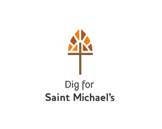
A charity dig to help with renovation of Saint Michael's Church.
As seen on:
Down With Design
Status:
Client work
Viewed:
8506
Share:




Lets Discuss
gareth i love this logo, although just a couple of things**the layout seems weird, kind of like it was just thrown together. the font for %22dig for%22 doesnt match the Saint Michaels' logo..**Also, if you extended the the cross downward a little more it would more like a shovel.**overall great concept, but to me, needs some refinement -- great job either way.
Replyi agree with penflare. This is a great concept, but with a little refinement it could be amazing.
ReplyExcellent concept! Favourited!
ReplyFor me I'm in between. I think the concept is great! Maybe a psuedo handle would work? make the cross sitting on a hill/handle?%0D*%0D*Great job nonetheless itsgareth!:)
ReplyI agree with wilson.... i saw the shovel and cross immediatly!
ReplyGOOD IDEA!
Replythanks DUCK!
ReplyNeat idea! I'm new here, just signed up so I could comment on this logo as it caught my eye right away. I love the concept and saw cross, stained glass and shovel immediately.**I don't have the technical expertise that a few of the commentor's have but that's why I'm here looking and learning!**Great work!
ReplyThanks clearnew and welcome to the pond.....
Replymy gosh this is amazing!!!!
ReplyFantastic solution, Gareth. I really like the type treatment.
Replyvery well done! :)
ReplyPlease login/signup to make a comment, registration is easy