Float
(Floaters:
52 )
Description:
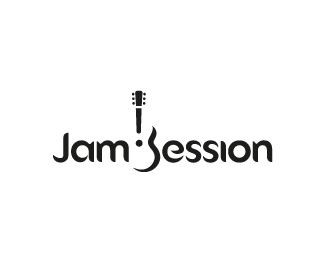
A new recording studio opening in Maryland.
Status:
Client work
Viewed:
19363
Share:



Lets Discuss
YES, gareth!
ReplyNice work.
ReplyAWESOME man!!!
Replytotally agree. pretty dang awesome!
ReplyThis is neat!
ReplyRock ON! Good concept.
Replyfriggin sweet
Replyhttp://citynoise.org/upload/28622.jpg
Replyit's perfect!
ReplyGreat idea, and the type is very good also. I think fixing up the perspective on the top part of the guitar would be perfect.
Replygood work Gareth!
ReplyNice one, Gareth H.
Replyvery smart Gareth:)
ReplyVery nice, man.
ReplyJammin' nice.
Replynice one :D
ReplySo clever!
Replysweet logo!
ReplyStunning work Gareth!
ReplyI really like the guitar and how the positive and negative space of it creates the %22S%22
ReplyLovin logos that utilize negative space! Awesome!!!
ReplyLove the font and the guitar graphic.
ReplyLogo bomb!
ReplyPlease login/signup to make a comment, registration is easy