LIQUIDO
by doraemon74 • Uploaded: Jan. 23 '14

Float
(Floaters:
1 )
Description:
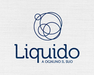
The concept of the logo originates from the definition of the liquid state of matter:
" A liquid is a fluid that, in the absence of external forces including that of gravity, has a spherical shape .. "
" The molecules or atoms that constitute the liquid interact. They are not among them in fixed positions but "rolling" on each other ... "
Through a process of revolution, a series of concentric circles are been shifted along the diagonals up intersects its center with the perimeter of the other. The result is an element of the abstract character can communicate volume and movement .
Distribution, diversity and cooperation emerge from the graphical representation in the interpretation of corporate values .
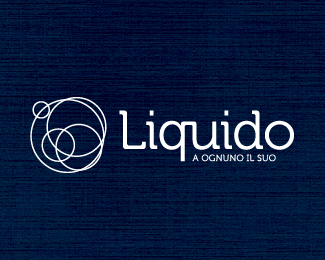
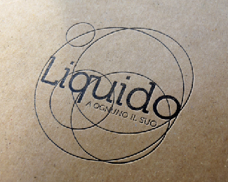
The logo is placed at the center of the brand in conjunction with the payoff .
The graphic reminds association for the carbon dioxide given off by carbonated soft drinks and sparkling wines, or alternatively the concentric circles that are produced on the surface of water .
The graphical representation of a wire rim gives elegance to the brand and the minimalism that allows him not to ever be excessive in its manifestations.
In this way, the symbolic element assumes a secondary weight compared to the logotype succeeding at the same time to be the vehicle of the values expressed above, thanks to the effect of the movement generated by the dislocatin of the elements and its different dimensions.
The soft lines of the font and the roundness of the forms come together in a perfect balance .
Status:
Client work
Viewed:
2019
Tags:
rounded
•
rounded
•
circle
•
blue
Share:


Lets Discuss
Please login/signup to make a comment, registration is easy