

Description:
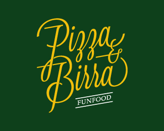
Brand design for a franchise of restaurants.
The chosen naming is simple and direct, communicating to the public on its core business.
We wanted to reinforce the simplicity and clarity of the brand through a married italic lettering, the regular structure but casual at the same time.
The sweeping curves and soft imply a mood cheerful and friendly as well as the food that is being proposed, a food for just "fun."
To this end, we propose a pay-off that it is a remake of "fast food" in a "fun".
As seen on:
https://www.behance.net/gallery/PIZZA-BIRRA/14349107
Status:
Client work
Viewed:
2960
Tags:
yellow
•
typographic
•
italian
•
green
Share:




Lets Discuss
ahhh ... cosi mi viene la voglia .... una margerita per piacere ... bellissimo lavoro, fabio !!!
ReplyGrazie mille ;)
ReplyPlease login/signup to make a comment, registration is easy