Description:
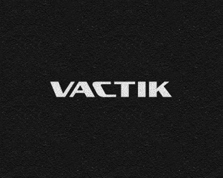
10+ year old logotype design I did for a Dutch webdesign & development firm, which is still in use today.
© Gert van Duinen | cresk design
Status:
Client work
Viewed:
2785
Share:


Lets Discuss
Interesting type work, not too keen on the C leaning backwards but it does fit together well.
ReplyThanks Richard, well it's an old wordmark I developed during a period of time I was the co-owner of that company. The logo design ironically was just a little side-project we needed to wrap-up in a very short timeframe. Personally we liked the design and the diagonals accompanying it. I guess that's why it's still in use today :P
Replynice wordmark, i think you lost control because the T needs to be spaced tighter to the c and i just slightly
ReplyMakes sense, though this logo was made in the late 90's and hasn't been updated ever since. Spacing can be subjective and personally I think it's spaced very properly though.
ReplyPlease login/signup to make a comment, registration is easy