Description:
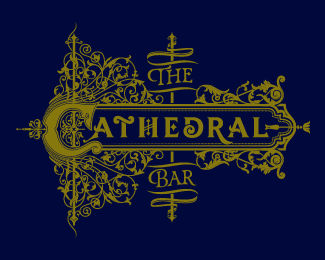
Identity and collateral for the cathedral bar in downtown oakland, CA. More info at http://be.net/cream5
Status:
Client work
Viewed:
3098
Tags:
•
type design
•
fleurons
•
illustrative
Share:



Lets Discuss
This is outstanding work, but man I really feel like the colors are killing it. I almost completely passed it by without a glance. Would you be game with trying for some more contrast, or a more 'vintage' color set? (Very personally, I feel like a burgandy/gold would come off awesomely.) Did you hand illustrate all of the scrollwork?
ReplyHey lubera, Oh right yeah the colors are a lil dry. Client requested that dull ochre but it was just for screen, the real thing was going to be foil, gilding, etc. Yeah all hand done. Tx man.
ReplyPlease login/signup to make a comment, registration is easy