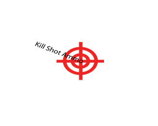
Kill Shot Ammo.
by bullmastiff07 • Uploaded: Oct. 28 '10

Float
(Floaters:
0 )
Description:
Just working on my logo design. Any comments? This is my "BRAIN DUMP" logo.
Status:
Student work
Viewed:
1348
Share:


Lets Discuss
Yeah.
Reply%5EThat's just like your opinion man.
ReplyTry to put the name for one time, not on every bullet %26 over cross-pointer.
ReplyBig Lebowski FTW, Joe.
ReplyIs it supposed to seem phallic? I would start in black %26 white and really refine the shapes if you are set on going with a literal representation of bullets.
Replylol
ReplyTry a cleaner approach. Way too much going on here.
ReplyHaha Milosz, exactly. Well it seems as me and you watch too many movies. Heh
ReplyI don't want to comment on this for fear of pissing off someone whose logo reads %22KILL SHOT AMMO%22. But yeah, I'd try simplifying things a lot.
ReplyI like the general direction your going. I'd lose the gradient in the bullets and I think lose some of the kill shot text.
ReplyI agree with milou a little repetitive with the name. Maybe try one bullet going into the target.
ReplyI would lose the bullets. Maybe move the text around the cross hairs.
ReplyI like the concept of using %22cartridges%22 but it looks a little too busy, and...phallic :)
ReplyI like getting rid of the bullets, unless you really like them
Replyhmm. generally having the name of the brand in three different places is not a good idea. there's a lot to improve on, but if i was to select one thing just have the type show up once, much bolder, and somewhere visible and obvious.
Replybullmastiff07, *I agree with most on this posting, this logo has way too much going on. You need to simplify it without getting clich%E9. You need to be careful with this logo because the risk of being clich%E9 is way high. If you pull the bullets off and leave the target this would be clich%E9, if you keep the bullets, they need a ton of work!
ReplyPlease login/signup to make a comment, registration is easy