aces redo
by bullmastiff07 • Uploaded: Nov. 02 '10

Float
(Floaters:
0 )
Description:
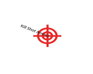
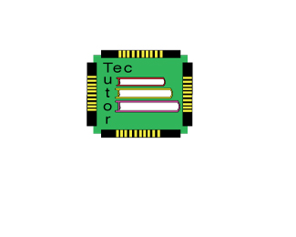
I redid this logo to be less cliché. comments welcome!
Status:
Student work
Viewed:
895
Share:


Lets Discuss
bullmastiff07, *Now we are headed in the right direction. I still think it needs some work, but much better than the first. Lets play around and explore some other ideas and see what we can come up with.
ReplyThis one looks much cleaner, but maybe you could make the suits a little bigger or use one suit and bring back the card from your other idea.
ReplyThis second attempt is much better I would like to see the faces of the cards in red as well as in black. Move them to have alternating colors.*
ReplyPlease login/signup to make a comment, registration is easy