Description:
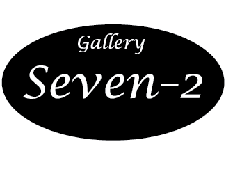
This is a logo that we had to make for class. It is for a high end auction house called "Gallery Seven-2". They wanted a look from the late 40's to late 60's era and this is what I cam up with.
Status:
Student work
Viewed:
1119
Tags:
Gallery Seven-2
Share:




Lets Discuss
im not a huge fan for the fact i know you can do better, get more out of you. again i think that this was easily and simply done fast, not much to it. id like to see a little more from this logo.
ReplyI do my research and found that most of the logo's from the late 40's to late 60's was mainly type based. That is how I came up with this logo.
Replyyes you are right but there is more to it, this doesn't look retro or back in the 40's or 60's stage.
Replyand i could be wrong but I'm pretty sure its an auction based not a gallery??
ReplyUM...... I dont understand this logo. I would start all over.
Replyit does say gallery my bad but it is also an auction house.
Replyseems a bit boring for any business. add some color, some negative and positive space...something.... cheers
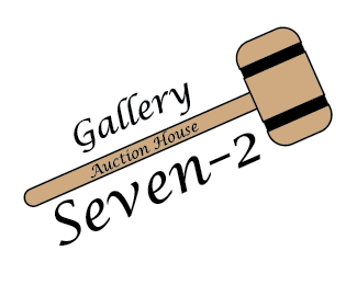
ReplyDid a rework, to look go to: http://logopond.com/gallery/detail/176164
ReplyPlease login/signup to make a comment, registration is easy