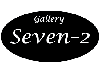
Gallery Seven-2
by bryanlauer11 • Uploaded: Jul. 25 '12

Float
(Floaters:
0 )
Description:
This is a logo that we had to make for class. It is for a high end auction house called "Gallery Seven-2". They wanted a look from the late 40's to late 60's era and this is the second one that I came up with.
Status:
Student work
Viewed:
1195
Tags:
Gallery Seven-2
Share:


Lets Discuss
I really don't see a problem with this logo at all. the Hammer reminds me of either a courthouse or an auction house kind of thing though. the font is a good choice too for the late 40's look, however it does feel a little more 1800's to me in a sense. other than that nice job.
Replyi don't see this has anything special, it just is lacking in every way. the font does nothing for me, i would like to see some play maybe with positive and negative space, some color. having the type and mallet on a angle, does not benefit this at all. cheers.
ReplyPlease login/signup to make a comment, registration is easy