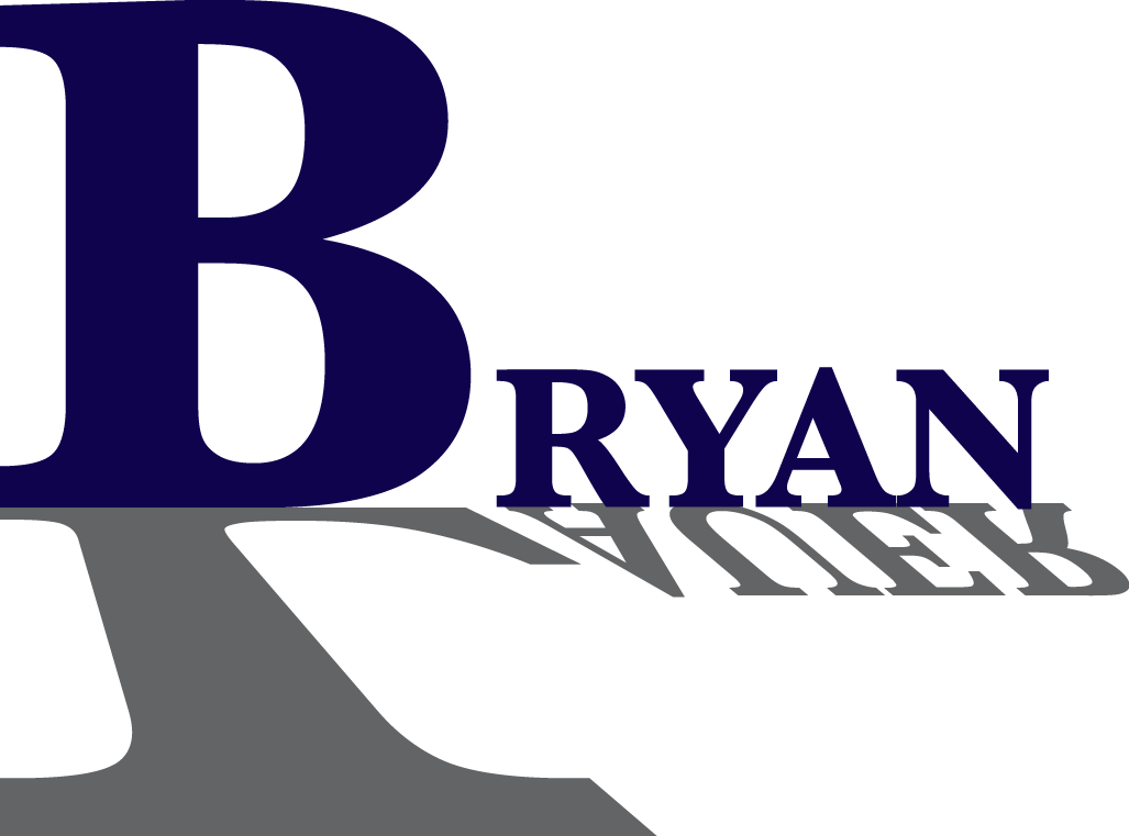
Country View Elementary
by bryanlauer11 • Uploaded: Jul. 20 '12


Float
(Floaters:
0 )
Description:
Here is the logo for a local elementary school located in West Haven, Utah. They are known as the colts and I wanted to get a colts head that mirrored that would resemble a "C" and add the "olts" to the end of it.
Status:
Student work
Viewed:
1316
Tags:
Country Veiw Elementary
•
Colts
Share:


Lets Discuss
i really like i the idea concept but you can't read it like it spells colts. you can see the " C" and i think the gray is to thick. so if you somehow fix that i think it'll be an okay logo. i just saw the second one and i defiantly like the colts heads on the sides instead. but I'm not to big on the font. but i still thnk that the gray is to thick
Replybryanlauer11,
ReplyJust as a heads up: I think this is very close to this
http://www.google.com/search?hl=en&client=safari&rls=en&q=boise state logo&bav=on.2,or.r_gc.r_pw.r_cp.r_qf.,cf.osb&biw=1276&bih=657&um=1&ie=UTF-8&tbm=isch&source=og&sa=N&tab=wi&ei=pLQNUJj9Mai42wW_6YHwCg
Not been the logo police or anything just giving ya the heads up. It might appear to some that you just traced the Bosie State logo (a lot of your lines are the same).
Also I am usually NOT a fan of replacing a letter in a logo with an illustration or object, this usually never works! Keep that in mind. I don't know if having two "colt heads" adds to this logo. I feel that one would be sufficient. This would be a case that the designer over designed and didn't know where to STOP. I would try a few more variations on this logo as I think that you could nail it!
It is derivative of the Boise State logo in my opinion. If they decide to sue you for copyright infringment, I believe they would have a case and you would suffer for it.
ReplyTime to draw up something else.
@lancegarcia Wow. How immature and incredibly inappropriate for this website. Take your filth somewhere else. Trish was trying to give constructive criticism. What in the hell is wrong with you?
Reply@lancegarcia school project or not, it doesn't make it right. now is the time to look up to these experienced designers who are willing to critique (i assume) students like yourself.
ReplyI appreciate all the critiques I am getting. I also found that Atlanta also use the same horse head but made a couple of changes to it.
ReplyVisit here to see. http://www.rgrembroidery.com/DES_IMAGES/CORPSH/ATLANTA COLTS HORSE 24 PB 194.JPG
ReplyI like the color choice for this logo, but the C definitely needs to be changed. I can read it as a C but other people may not be able to. perhaps take the top part of the C and use that on top of the Colts?
ReplyDid a rework, to see go to: http://logopond.com/gallery/detail/176167
ReplyPlease login/signup to make a comment, registration is easy