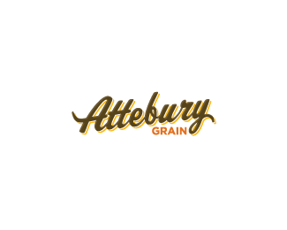
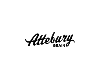
Attebury Grain
by bartodell • Uploaded: Mar. 30 '09 - Gallerized: Mar. '09

Float
(Floaters:
56 )
Description:
Concepts for a large grain company in the tri-state areas of Texas, Oklahoma & New Mexico.
Status:
Nothing set
Viewed:
14691
Share:


Lets Discuss
Nice type logo, Bart.
ReplyThanks guys! Jon, hey man the company is headquartered in Amarillo with me. So it is not my fault! LOL!
ReplyGreat type treatment.
ReplyThanks.
Replylovely. I'm just in love :)
Reply%25Well done!%25
ReplyAh thats hot! Love the type... is that a font?
ReplyVery nice type treatment!
ReplyAH! this is sooooo tasty. Beautiful type work.
Replynice... how does it look in black though?...
Replynice type
Reply%22Nido%22:http://logopond.com/gallery/detail/58340 Smart@%24%24
ReplyGood strong logo. I imagine it will work well across all mediums too. Would love to see it on a t-shirt.
ReplyLove the type. %22GRAIN%22 could carry the same angle as the Attebury to eliminate the trapped negative space between the two words. Very minor, but great job! I'm looking forward to seeing more!
Replyi haven't really commented on your attebury grain logos, but i really dig them. If the grain company decides to go into beer making, this logo would look great on a bottle! :P
ReplyThe font and the colors are awesome!
ReplyGreat!
ReplyEverything is working except for that %22b.%22 Attebury reads with forward momentum but stops because the bowl of the b slants to the left slightly. Looks great otherwise.
Replyvery very nice type. my favourite from this set.
ReplyThis is nice.
ReplyWoah missed this one Bart...sweet!
Replythat's just yummie, very very yummie!
ReplyPlease login/signup to make a comment, registration is easy