Description:
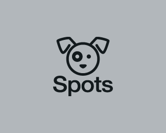
An older logo of mine. Designed for a dog grooming company. Spots has existing text and hired me just for the creation of a cute and memorable dog icon. I went ahead and uploaded the version with the type.
Status:
Nothing set
Viewed:
12880
Share:



Lets Discuss
Cute mutt :)
ReplyReally love your use of simple shapes. Nice work, Bart-man.
ReplyThanks Roy and Doc. Sometimes simple is better. :)
Replyhey.. looks like that battered critic logo of yours.. this his dog%3B) ... anyway, the uppercase S is slightly throwing it off for me on this.. maybe would conform better with a lowercase s... nice though bus.. simple %26 stylish.
ReplyLol @ nido : I thought the same thing. :-P
ReplySpots was actually 3 years ago. LOL. Found some old DVDs that had a bunch of older work on them. Hey what can I say. At least the dog can not help that he has a black eye. Critic deserves one.
ReplyYou should have made the O the same thickness as the eye. well don't have to but wonder how that would have LoOked,
Replywell balanced image%3B well kerned text%3B plus, who doesn't love a little helvetica? great work. i think the upper-case S is fine.
Reply%22You should have made the O the same thickness as the eye.%22**Mike, that was my immediate thought when I saw the image on the gallery page. Great minds think alike...
ReplyHa Jeff, yes! like coming up with a great name also he he :-)*Nice work bartbart
ReplyPerfect!
ReplyThanks to everyone for the comments.
Replycutie
ReplySelected for LogoLounge Volume 5!
Replywow... great stuff!
ReplyJust got the email this logo was selected for LogoLounge project, %22Animals and Mythology%22, the second book in the new Master Library series.
ReplyPlease login/signup to make a comment, registration is easy