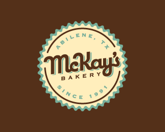
McKay's Bakery (2)
by bartodell • Uploaded: Oct. 25 '07
")
Float
(Floaters:
10 )
Description:
This is my second logo concept for my cousins famous bakery in Abilene, TX. So next time you are in Abilene, stop by and get some great baked goods. The desserts are to die for.
Status:
Nothing set
Viewed:
4814
Share:

Lets Discuss
I really love the colours. Its very fresh and the mark works very well on packaging I think! Only the type of bakery is a little to extended maybe... great works!
Replyno no... the first one was a way better. If I didnt saw the first concept I would say super but first is just perfect and so strong. I hope your cousins will decide take the first concept.
ReplyNot me, I like this one better! The font for the name is nicer, I like the lines added around the smaller text, I like the lacier doily look of the border, and the retro-ness of the whole thing.**this is REALLY PICKY but the only thing that bugs me is the A in Abilene is a little close to the M in McKay's, compared to how much breathing room the other blue letters have. Maybe you can cheat it just a bit- rotate the top text to the right- without it looking crooked?
ReplyGreat retro design!
ReplyPlease login/signup to make a comment, registration is easy