Description:
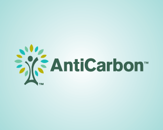
Logo designed for a company that helps individuals reduce and repair their own personal carbon footprint on the environment. The logo is a combination of 3 elements. A windmill, for renewable energy, A person, for a human element, and A tree, to symbolize a new beginning.
As seen on:
Status:
Nothing set
Viewed:
3397
Share:


Lets Discuss
whoa
ReplyGreat solution. People/figure icons are tough. And you've managed to create something unique. Colors are nice as well. Kudos, Bart!!
ReplyThanks Guys. This one was a fun challenge.
ReplyTop work%3B once again, Bart.
ReplyYou nailed it,nice Bart!
ReplyLooks like you managed to pull it off BART BART.
ReplyThanks everyone. I appreciate the positive feedback.
Replyvery first seeing, it says its unique.. and nothing to wonder it comes from bart.
ReplyI am not following you rambal. Care to explain a little further?
ReplyGreat work!*Kinda reminds me of the Wolds College logo, though*http://logopond.com/gallery/detail/20554
ReplySorry but mine is not clip art. %3B)
Replyi think rambals saying that its unique.. %26 he would expect nothing less from you Bart...%0D*%0D*I also thought wolds college though.
ReplyDidnt think it was :)*Just reminded me of the other logo.
ReplyI still think think there should be a category to critique company names, apart from design. I don't get it. Why would you want to encourage people to be against carbon? Without carbon there would probably be no life on earth.**Assuming this has to do with greenhouse gases, CO2 molecules have twice as much oxygen as carbon. Shouldn't it be AntiOxygenCarbonOxygen.org?
Replyhttp://en.wikipedia.org/wiki/Carbon_dioxide**that's okay, no one usually appreciates my sense of humor... :-)
ReplyPlease login/signup to make a comment, registration is easy