Description:
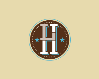
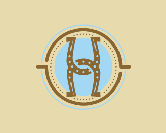
This is a project for the Convention and Visitors Bureau in Lubbock, TX. The brief about this project is volunteers for local city events. This is for the tourists and citizens of Lubbock to distinguish the volunteers from the attendees at the events. The concept of the mark is very simple unlike the other concept. I wanted a simple brandable, excuse the pun, icon for the identity. This one combines letterforms LTH (Lubbock, Texas Hosts), and abstract spurs. Typesetting to come!
Status:
Nothing set
Viewed:
4905
Share:


Lets Discuss
I think this is a good concept and the colors are nice, but I think it reads HL not LH.
Replybart.. i think you over using this style.
ReplyFive...these concepts were all evolutions of the original concept. There were certain elements the cleint liked and wanted to keep during the process. This tends to happen with clients.
ReplyI love the concept and style. I think it's well excuted...**I see %22LH%22 first...the %22L%22 being a different shape drew my eye there first.**The %22T%22 was a bit hard to find for me at first as it was smaller than the other two letters.
ReplyNice job. I see the LH right away, but the 'T' doesn't stand out for me. Also, the bottom notch on the L comes a little close to the right star thus making the LH feel off center. Does it need to stick out at all?
ReplyThe bottom left of the L incorporates a cowboys spur. Thanks for the comments guys.
ReplyI really like your work. Excellent showcase.
ReplyPlease login/signup to make a comment, registration is easy