Description:
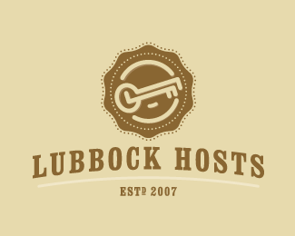
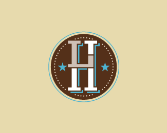
This is a project for the Convention and Visitors Bureau in Lubbock, TX. The brief about this project is volunteers for local city events. This is for the tourists and citizens of Lubbock to distinguish the volunteers from the attendees at the events. The concept of the mark is very simple unlike the other concept. I wanted a simple brandable, excuse the pun, icon for the identity. Typesetting to come!
Status:
Nothing set
Viewed:
2853
Share:


Lets Discuss
I like both marks that you've done for this project. The first one because it has the %22key%22 which I found very logical because you have the word %22hosts%22 in the name. And the second because of the strong symbol of the horse-shoe. And it came to mind that a third direction could be doing the horse-shoe and the key symbol together, like the horse-shoe endings could have key shapes, just a thought. But both your logo directions are good. And I love the colors.
ReplyPlease login/signup to make a comment, registration is easy