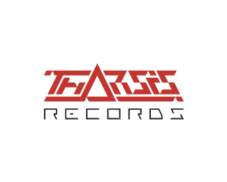
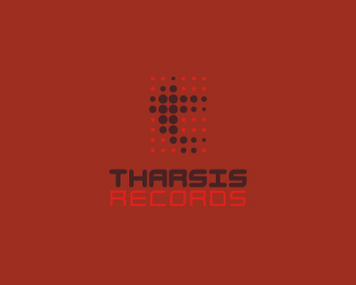
Tharsis Records v.2
by atomicvibe • Uploaded: Aug. 16 '11

Float
(Floaters:
2 )
Description:
Old, unused proposal for an electronic dance music label, specializing in Tech House and Electro. The name is taken from the Tharsis region on Mars, the largest volcano range in our solar system. The symbol is a stylized, geometrical representation of the unique arrangement of the Tharsis volcanoes, while the individual facets can be seen to represent movement in music. The type is custom, and reflects the 45 degree angles in the symbol. Color is indicative of Mars. Overall, I wanted the aesthetics of the mark to coincide with the synthetic techiness of the music, but I also wanted it to look very futuristic and sci-fi, as if it were an emblem on a Martian spacecraft.
Status:
Unused proposal
Viewed:
3699
Share:


Lets Discuss
Oh man ... that's bitchy awesome ...
Replynice:) think type could go alone:)
ReplyThanks for the floats, guys!**@Bernd, LOL! Since my client slept on this design, I need someone to buy this bitchy little piece! I can sell it to you, if you want. Are you feeling bitchy enough?**@Deividas, thanks, man! I think you're right, but when I did this, one of the client's requests was that the mark reflect (somehow) its namesake. I figured this symbol was a nice, abstract way of handling this request. Plus, its angularity gives rationale to the angular structure of the type.
ReplyPlease login/signup to make a comment, registration is easy