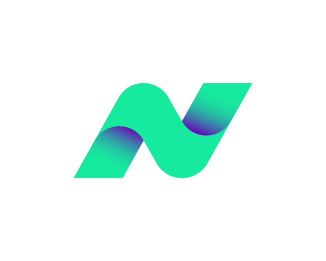
Abstract “N” Lettermark Wave Logo for Modern B
by artology • Uploaded: May. 01 '26

Float
(Floaters:
3 )
Description:
A clean “N” lettermark formed with flowing wave lines, symbolizing motion, adaptability, and continuous growth.
Its smooth geometric style makes it ideal for tech, digital, and innovative brand identities.
For project inquiries, feel free to reach out directly: 📧 raseltangail0@gmail.com
As seen on:
Branition
Status:
For sale
Viewed:
143
Tags:
and innovative brand identities.
•
digital
•
and continuous growth. Its smooth geometric style makes it ideal for tech
•
adaptability
Share:


Lets Discuss
Please login/signup to make a comment, registration is easy