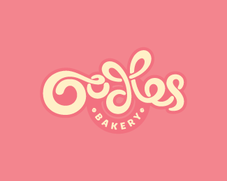
Description:
Finally happy. Thanks for your help, everyone.
__
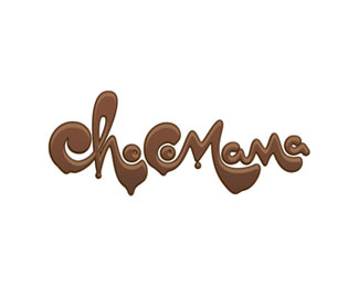
Hand drawn type for a bakery - would really value some fairly urgent feedback on this one please - think it reads ok, but would be very keen to have that verified! Cheers
Status:
Work in progress
Viewed:
15813
Share:

Lets Discuss
Sexy curls, my two cents would be to make that e leg bolder it could bring more readability to it, more compact feeling there is needed. Other than that, good job!
Replysome minor flaws, but I looks very good overall
ReplyThanks Milou and Floris - much appreciated. I'll have a look at that e Milou. Floris - care to elaborate on the minor flaws? I'd like to get this perfect!
ReplyWell, what Milosz said and when people see a logo for the first time they tend to scan, not read (especially when it is no that legible). The first thing I saw in the logo is a big H sticking out (d l).
ReplyI agree with Milou on the e other than that I feel it's readable. I also think that fixing the e would make the d l that Floris is talking about not look so much like an H. Really nice work here!
ReplyCheers all. I'm just tweaking the e (and consequently also the s) to see if I can get that working better.
Replyi think it's the l-e for me. it mimics the d in front of it, which really only works (for legibility) when it is a one-letter mirror, such as 'd-b' or 'J-L'. Subsequently, i had trouble with it at first. Saw a big H in the middle, then a d-b. I don't think you need the looping connections between the d-l. You have a lot of circular forms already happening in the mark (O,o,bottom of d, e, top of s), so i think that d-l thing just confuses it. Yes, the bottom of that e, as well as the connecting flow of the l-e could use a little love. So, in recap, %22Ood%22 is great as stands and i wouldn't touch (i particularly love that little loop on the lowercase o). The 'l', in my opinion, doesn't need the loop on top. It could come straight down at a more verticle angle, as not to mirror the d. I'd keep the e connected to the l, but make sure there is enough distance/disconnect between the two so that they aren't mistaken for one letter. Clean up the foot on that e, and maybe it doesn't HAVE to connect to the s because that would make it a 3 letter long noodle, which is big in comparison to the rest of the mark. Lastly, i think you have the opportunity to do something cool with the s. I'd swoosh the bottom of it underneath the other letters to where it's almost touching the right side of the 'd'. This would counter that lovely swoop on the O. Anyway that's my 2 cents. Well, looking back at how much i've just typed, it's more like 2 dollars! (ok ok, bad joke.) Lookin good, though! Really like the direction of this!
Replynice hand lettering
ReplyThanks Bernd and Nathan. **Nathan, interesting stuff. I'll have a quick think about making that work. For me I actually really like the loop on the d and l - it gives a good flow and results in what I think is a really nice shape. I don't see an H (although I can see how it could appear as an H) but a couple of people on here mentioned it so I have to weigh it up. Cheers!**And thanks everyone for their feedback so far.
Replygreat peice of type work. Honestly i couldn't read what it said until i read the description. But sure you can keep the look and still clarify the type...keep it up
ReplyCheers
Replycould use some readability..nice look though
ReplyGreat solution!*Looks very nice
Replywow this one is so so so nice! VERY GOOD!
ReplyThanks Jure, Alena and Paul. Working on the readability and I think I've pretty much nailed it now. Will upload an update soon!
ReplyANOTHER UPDATE: Tweaked the e to join at the base which helps readability a lot. Slightly tweaked the d-l to look less H-like. Finally happy. Thanks for your help, everyone
ReplyMuch better, mate. Quality of the image is somehow poor, can you update this to clear image?
ReplyCheers Milou - have updated with a PNG rather than a JPG, looking clearer to you?
ReplyOh yes, now the image id clear, and it looks tasty!
ReplyGreat, cheers! I agree, makes me hungry for a great big cupcake...!
ReplyYes! It really worth to be in the gallery :)
ReplyWow...Really good!
ReplyThis really turned out terrific. love the colors also. tasty.
ReplyFantastic! If it didn't say %22bakery%22 I would have thought it was a pasta place. %3B)**My thoughts: Make the loop of the L a little taller. And perhaps make the inside of the swirl of first %22O%22 a smidge fatter so it makes it like a dab, or blot of icing.**Again such a fabulous, beautiful piece.
ReplySweet %26 sexy :D
ReplyNicely Finished! Congrats
ReplyImpossible to read, but amazing. :)
ReplyAgree, great to look at...but unreadable.
ReplyI actually read it right away. Worried though, someone might steal the logo and call it Noodles.
ReplyGreat sweet mark.
ReplyThanks for the comments - and gallery add!*Yep, it's a toss up as to wether it's readable or not. I think it is, client thinks it is and enough people have given positive feedback about it - I'm happy enough.*Thanks again everyone that helped out with feedback and left nice comments - much appreciated.
Replysuch a trip just looking at it - nicely designed
ReplyThanks Raja - much appreciated
ReplyI remember seeing this one several months ago, but I never got around to commenting on it. I love it. I think you did a wonderful job with the type. It's got really great flow, and I love that you found a logical and creative way of incorporating the word %22Bakery%22 into it, rather than just slugging it below. Really superb job, overall.**I see that others have brought up some legitimate concerns about readability - specifically relating to the d-l combo. While I agree with the logic behind their concerns, I honestly don't see it as being a problem here. For what it's worth, I read it as %22Oodles%22 right away.**Funny thing about readability. To me, it becomes problematic when a word or words can easily be mistaken for something else. But sometimes, people don't give enough credit to the human brain for being able to instinctively and involuntarily seek to derive logic and meaning, and to quickly decipher puzzles it encounters.**That's how I look at your Oodles logo: a visual puzzle to solve. But, for people who speak idiomatic English, this really shouldn't that difficult of a puzzle - especially since you've obviously put a lot of work into creating a visual onomatopoeia by making an association to the world %22noodles.%22**I assume this to be an American bakery (or at least a bakery in a country that speaks native, idiomatic English), and as a native English speaker myself, my brain sees the fluid, loopy forms, makes the connection to the word %22noodles,%22 and by instantaneous process of elimination, I determine that there is absolutely no possibility this word could be anything BUT %22Oodles.%22 It certainly isn't %22OoHes,%22 and there's no way it's %22Oodbes.%22 Why? Because those words don't make any damned sense, that's why. %22Oodles%22 makes sense. In this situation, my brain had to make an educated guess, and thanks to your brilliant visual, it guessed correctly.**So yes, this could be more legible, I suppose, and generally speaking, we designers should always strive for maximum legibility. But sometimes, like in this particular situation, being like 90%25 legible is enough.**AND I'M OUT!
ReplyVisually, this looks fantastic. However, I would be a little concerned with legibility.
ReplyOops. Just accidentally removed an awesome comment on this and can't see a way of getting it back! Sorry to the guy who spent a lot of time and effort on that response - I appreciated it and didn't mean to remove it! Sorry...
ReplyIf you could let me know who it was that'd be great...!
Thanks!
ReplyAnd many thanks to Atomicvibe for such a reasoned and well thought out commendation. I agree - the legibility doesn't bother me as there are no real other options it could be. Might take a moment longer than something more straightforward but most people would read it fine.
ReplyPlease login/signup to make a comment, registration is easy