Description:
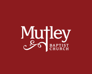
Showing the cross at the centre, this logo hints at the 'christ centred' attitude of the church, with the flourish indicating life and energy.
The logo needed to keep a good balance between classic/traditional and modern/contemporary feelings.
Status:
Nothing set
Viewed:
2913
Share:


Lets Discuss
I like it :) Very nice logo
ReplyJust curious, have you altered the %22M%22? I'm really liking this a lot and how you emphasized the cross but that %22M%22 seems like it needs attention. I do like the typeface though. Good job.
ReplyNo, not altered the M - I think that's just the way it is. What about it doesn't seem right?
ReplyPlease login/signup to make a comment, registration is easy