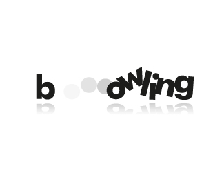
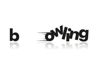
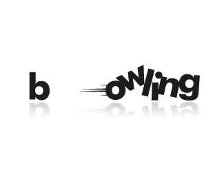
bowling
by ApplexDesign • Uploaded: Feb. 19 '13
Description:
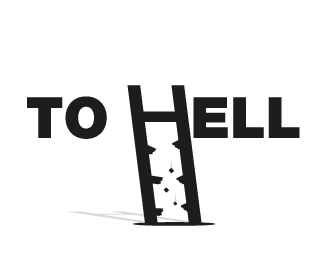
bowling text concept
Status:
Just for fun
Viewed:
22669
Tags:
game
•
black
•
ball
•
bowling
Share:



Lets Discuss
I'm sorry. I accidentally deleted the comment :( :(
ReplyWhat do you think now?.....
Thank you very much!!!!! :)
better, in my opinion shades should not been used and the O stripes could be a little smoother. Try to do a little smaller version than this ;)
Replythe shadows/reflections don't bother me too much on the letters (bowling lanes are very shiny and highly reflective), but they should definitely not exist on anything designating movement. I am also ok with the size. my old eyes have trouble with details on some of the smaller offerings on this site.
Replyif you did a two color variation, with the bowling o red or orange with the rest black, and you could do away with any additional indicators of movement, altogether.
ReplyPlease login/signup to make a comment, registration is easy