Description:
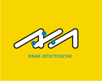
A logo used on leaflets promoting a discount on foreign language courses in our company. In practice, this was more a one-shot pictograph than a long-term logo, even though it technically is a logo for the language school.
As seen on:
Status:
Nothing set
Viewed:
4900
Share:


Lets Discuss
hey everyone!... check this nerd out!...
ReplyHaha!! NERD!! I see a tongue and a tulip. I think this one might look better if the grey within the book was removed and the lines within the book become that light grey color.
Reply@Ocular: An excellent eye you got - the logo was originally printed only in black and white, the book was hollow white, and the lines were black. Added grey for LogoPond.
ReplyThanks, apostol! The updated version is so much better in my opinion. Keep up the good work.
ReplyGreat design, I'm not sure there is a need for the grey lines at all, in my opinion. Either way this caught my eye, nice job on this.
ReplyGreat concept...cuaght my eye right away.**I would suggest though that the tongue does look a bit rigid compared to the book. You could really add some flow and perspective if the tongue was wavy, maybe fatter on the tip like it was licking at you...not too much though, just enough to give it some movement and depth.**otherwise..nice piece.
ReplyPlease login/signup to make a comment, registration is easy