Description:
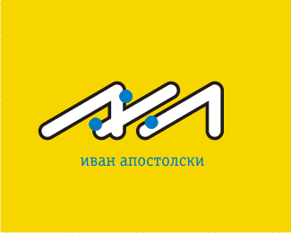
My personal logo. Now for those unfamiliar with Serbo-Croat language and the Cyrillic script - the percent sign is pronounced "posto" (po-sto literally means per-cent), and the third symbol is Cyrillic "L". Thus, this is A-posto-L, in a roof-like shape. I happen to make a living doing 3D architectural renderings.
Status:
Nothing set
Viewed:
2622
Share:


Lets Discuss
i think the integration of the %25 sign as a concept itself is great, but the blue dots just don't fit in there**i would have kept it just in black and white, and fully integrated the dots, like combining them with the rest of the shape and giving stroke to whole.**anyway, nice work, a%25l
Replywhy there's 3 dots in percent sign?
Reply@tyggy: the first dot is to form A. Without the dot it would be a letter L, like the rightmost one.
ReplyPlease login/signup to make a comment, registration is easy