Float
(Floaters:
21 )
Description:
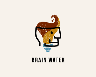
Logo proposal for Brain Water, a fortified water beverage.
Status:
Unused proposal
Viewed:
6249
Share:


Lets Discuss
I like this. Neat style.
Replylove the style
ReplyPretty cool!
ReplyI absolutely love the illustration style, and the concept is awesome. But I have to ask: What's your rationale for the color choice? Brown and brownish-yellow are colors I DO NOT want to associate with water, especially not any kind of water I want to drink. I see you've got some blue in there, but its usage is minimal. Is there a reason why you generally avoided using blues and blueish-greens to suggest water?
ReplyThanks everyone for your comments :) *@atomicvibe: thanks for your comment in particular. Your point is very reasonable. I should have considered the feelings brown and yellow evoke in people when linked to water. I've tried a bunch of different color combos and using brown and yellow felt the most pleasing as they give the background for the face and the wave/hair. When using blue as the background color, the human face looked a bit like a drowned dead person... But I guess your aim is stronger and you're right :)
ReplyNice illustration.**
ReplyReally nice! I can see the color issues considering the application.
Replyi thought this was mikeymike's originally, which is a big compliment to you. awesome style.
Replyi like the style!
ReplyThanks guys :%3E
ReplyPlease login/signup to make a comment, registration is easy