Description:
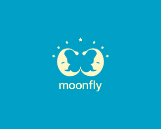
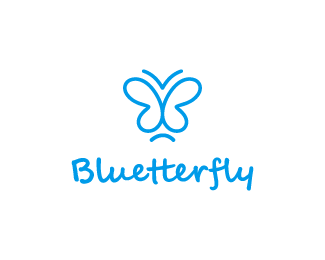
The main characters of the logo designed using positive space are two "sleepy" moons! There is however another character- hidden in the design! Seek for it!
As seen on:
Logoturn
Status:
Unused proposal
Viewed:
16509
Tags:
insect
•
butterfly
•
fly
•
tranquility
Share:
Lets Discuss
awesome work. added to favorites %3B)
Replythank you!
ReplyI love the moons!
Replywooww!! cool
ReplyGreat use of negative space!:)
Replynice
ReplyFloat and Save :-X
Replywell done nephew ... like it !
Replyhe's your nephew, b? he must take after his aunt and uncle (type and signs that is). great work.
ReplyAmazing design! but I would erase the stars and leave only those moons :) added to favs :D
ReplyNo, ColinTierney! Me and Bernd are not family related, but i call him %22uncle%22, since i am enjoying it! :)))
ReplyThanks for all the floats guys!
ReplyCongrats on gallery bud!
ReplySimple yet lovely. Congrats on gallery!
Replythanks a lot, rokis and muse7!
Replyfly, fly... butterfly
Replynice
ReplyGreat design.. Both the moons and the butterfly inside :)
Replywooow ! so nice :)
ReplyCool
ReplyVery nice! :D
ReplyPlease login/signup to make a comment, registration is easy