Description:
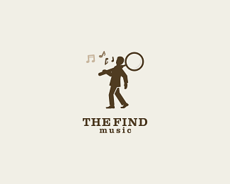
The Find is a full service music supervision company. Symbol is a man walking with a giant magnifier on his shoulder searching for music.
Status:
Unused proposal
Viewed:
12891
Share:




Lets Discuss
The problem is...the man does not look happy to lift the magnifier...looks like its to heavy..IMO..but i like the concept.:P
ReplyI'm not getting any sort of music connection. Could you had a little music note or something inside the magnifying glass?
Replyi had him whistling. but i was not that sure :P
ReplyThat might do it, Andrei. The guy has kind of a happy go lucky feeling in his step, if there were little musical notes in front of his head/mouth. If his head was just a touch more tilted back as well, that may help infer that he's singing or whistling. Very clean and intriguing mark though.
Replythat's what i felt too, Sean! i'll make this little change soon.
Replylet's see now! does the whistling work?
ReplyThe whistling is great, that brings the concept in but they are a bit too small right now. Also, and sorry if I am being annoying, Andrei, but it might help if the notes were %22double notes.%22 Subtlety is great but I wouldn't be afraid to beef up the notes and I personally wouldn't put a screen in them, go full density. Sorry, I'll stop now. :)
Replythanks for your time, Sean. your thoughts are helping!
ReplyI definitely like the concept.
ReplyBigger music notes. Don't worry about the proportions. Heck, the magnifying glass is huge. :-)
Replyhaha! thanks Kevin. i will sure change that, but now i gotta go out drink my beer! :D
ReplyAnyone sees a tennis racket here? Love the whistling . *btw, i love how the name almost sounds like %22define music%22
ReplyCool concept Andrei.*Maybe try with a small shadow on the magnifying glass...
ReplyLooking good! I agree %3E bump the notes, and you're solid.
Replythanks for your support and suggestions guys! made some changes regarding the musical notes. let's see: is it better now? :)
ReplyLooks nice, Andrei. The reflection in the glass might be a touch light, can barely see it. Another thought is some may not see it as whistling but rather he's singing, so it might be interesting if you explored a very slight indication of an open mouth maybe? Just a thought, please ignore if you want. I like the overall feel of it a lot. And I'm done now. Promise. Wait...no. Done.
Replythanks Sean. your comments were very helpful! i'll sure play with it more.
ReplyYeah, getting better an better%3B agree with ethereal on the reflection, you could do it the same color as the double-note, for consistency and visibility sake. Great job, nonetheless.
ReplyThat's very cool, I'm liking it. Haven't seen what have you got first, but now it's strong for me. The only thing I would change here is the mouth to make it more forward, and visible (like mouth when whistling). But it's a detail.
Replyhehe! thanks a lot Lecart and Milou!
Replythis one is real fun. nice job, Audreiu.
Replylove the mood of this logo
Replyreally like it.
Replyhahaha! I made this logo a while ago, and these days I have seen this: %22Trololo Song%22:http://www.youtube.com/watch?v%3DpYU7oG2V7uc .just look how this guy walks, it's like my guy! and the music is damn hilarious! :))
ReplyVery nice Andrei. I like the whole composition.
ReplyCool :D lol!
Replyvery cool I love his laid back stance
ReplyThis has developed nicely. Great work, bud!
ReplyTimeless!! Love it!!
ReplyPlease login/signup to make a comment, registration is easy