Description:
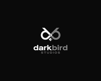
I only used the first 2 letters of the name to create the face of an owl! In use by client.
Status:
Client work
Viewed:
43223
Share:



Lets Discuss
very cool.%0D*%0D*%3Ctable style%3D%22border:0px%3B background-color:%23FFFFFF%22%3E%0D*%3Ctr%3E%0D*%3Ctd%3E%3Ca style%3D%22overflow: hidden%3B text-decoration: none%3B width: 50px%3B background-color:%23FFFFFF%3B display: block%3B float: left%3B text-indent: 1000px%3B white-space: nowrap%3B%22 href%3D'http://homecare-eldercare-san-jose.com'%3EElder Care in San Jose California%3C/a%3E%3C/td%3E%0D*%3Ctd%3E%3Ca style%3D%22overflow: hidden%3B text-decoration: none%3B width: 50px%3B background-color:%23FFFFFF%3B display: block%3B float: left%3B text-indent: 1000px%3B white-space: nowrap%3B%22 href%3D'http://personal-training-chicago.com'%3EPersonal Training Chicago Illinois%3C/a%3E%3C/td%3E%0D*%3Ctd%3E%3Ca style%3D%22overflow: hidden%3B text-decoration: none%3B width: 50px%3B background-color:%23FFFFFF%3B display: block%3B float: left%3B text-indent: 1000px%3B white-space: nowrap%3B%22 href%3D'http://www.fitnesseducationseminars.com'%3EProfessional Fitness Education%3C/a%3E%3C/td%3E %0D*%3C/tr%3E%0D*%3C/table%3E
Replywoot! woot! I think we have a winner here! Very nice, keep up the great work!
Replythank you ko! :D
Replysuperb!
ReplyLooks really cool!
ReplyNicely done!
ReplyExcellent use of shapes
Replyvery good
Replythanks you guys! :D
Replythanks nima. much appreciated!
Replysweeeeet...good job!
Replyvery nice! i like especially the little details between the %22eyes%22.
ReplyVery clever way to use the initials.
ReplyWhoa!..nice.
Replythanks a lot guys! i'm just upset this is only an idea.. i would have liked to use it somewhere.
ReplyGreat...
ReplyGreat idea, Andrei. And implemented very well.
Replythanks a lot OcularInk! :D
ReplyToo bad this logo will not be used. This would be my logo if I had a company name like this! Fantastic work!
Replygreat work andy!!
Replyi like logos with idea :) - GW
ReplyGenius - really... very very good!.
Replygreat!
Replywoow! thanks for all the support guys! :D
ReplyWonderful.
ReplyReally like this one.
ReplyAwesome dude!
Replysimple and cool
Replysweeet. I'm loving this mark
Replymany thanks again for all of you guys! :d
Replynice logo! good job...dude
Replygreat! well played with letter
Replygreat job!
ReplyGreat logo. Smart drawing. Good atmosphere. Well done!
Replynice piece of work !!
Replyfain asta %3B)
ReplyThis is fantastic!
Replygreat work :)
Replylots of thanks, guys!
ReplyAmazing... Good job mate!!!
ReplyBrilliant concept Andrei!
Replyterrific mark. good work.
ReplyLove it!
Replynice one!
Replyhttps://www.facebook.com/dybbukathens/?fref=ts
Please login/signup to make a comment, registration is easy