Float
(Floaters:
0 )
Description:
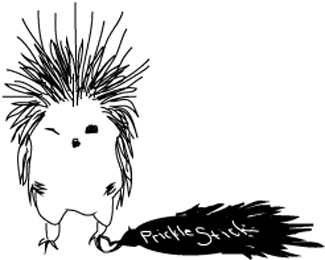
Third alternative to student logo project.
Status:
Student work
Viewed:
872
Share:






Lets Discuss
I like this as a poster or a banner at a sponsored event but in my opinion it would not work as a logo. As a logo it is too detailed and the type is very small and hard to read. Imagine this on a business card, yes it would be a cute little character but the viewer would never be able to see the text. Your Illustration is beautiful though, he's a great character.
ReplyADORABLE
ReplyI actually like this quite a bit, but as was previously mentioned, I don't know if it would work as a logo, as it took me a while to notice the name.**That said, I love the drawing a lot, it reminds me of Shel Silversteins stuff. :)
ReplyPlease login/signup to make a comment, registration is easy