Prickle Stick
by amethyst • Uploaded: Dec. 09 '11

Float
(Floaters:
0 )
Description:
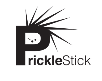
Logo 2 for student project.
Status:
Student work
Viewed:
935
Share:
Lets Discuss
Now this logo I can see in every skater shop on the planet. THis one is very well thought out and way fun. Most teens today would love this one.
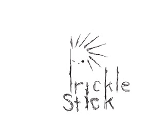
ReplyUnfortunately, I don't share the same enthusiasm about this. The letter 'P' doesn't actually read as a 'P' so when I first saw this, I read 'Irickle Stick'.
ReplyI love this one, The font is amazing! I think that it is great that you took it this direction. just like gary said and zane said i think that this would work great in the extreme sports areas. i think it's amazing steph.
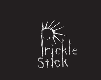
ReplyI LOVE any font that is hand drawn. Anytime you can use an element that is %22you%22 is an amazing thing. Having said that, the %22P%22 is difficult to make out and the complexity of the font lines may be an issue when it comes to embroidering and vinyl cutting, but that doesn't change how much I like the font. I could see this at the X games as a sponsor.
ReplyPlease login/signup to make a comment, registration is easy