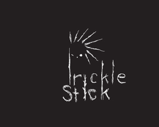
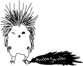
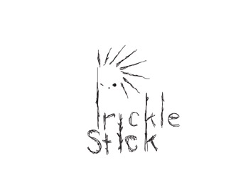
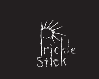
Prickle Stick
by amethyst • Uploaded: Dec. 08 '11

Float
(Floaters:
1 )
Description:
Logo idea for an anti-fungal cream.
Status:
Student work
Viewed:
851
Share:
Lets Discuss
I love this one!!! It is more on the conservative side, but is very clean. There is some small issues with some of your cool spiky dudes. THough I do have problems seeing this on a T-Shirt or a hat.
ReplyI like this one!! I like that it is remotely clean. Also with this one it would be easier to use on a wide spectrum, especially with a vinyl plotter. Where the others would not be so easy..
ReplyThe %22P%22 is very over powering. A possible solution would be to make it small so it balances better. I like the thicker font with the thinner font, its kind of trendy but its a trend I like. Your spikes are very cool and he (your porcupine) has a cute face.
ReplyCute. The P is thick but I like it.
ReplyI love the face, I love the spikes. The %22P%22 is just too much though, it's too heavy.**I sooooo love the face though. :)
ReplyPlease login/signup to make a comment, registration is easy