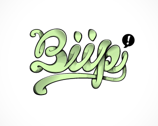
Description:
New logo for Biip. Moving from mobile community to social community. Has to look aproachable and cool to the target audinece between 14 and 25 years. The breif from the client was; organic, playful, bold. Impressions; Has to look cool, a place where things happen, a place where your friends are, a place where you are the center, electronic love
Status:
Client work
Viewed:
2446
Share:


Lets Discuss
cool
ReplyLooking good my man!
ReplyNice approach.
ReplyFUNtastic!
ReplyThanks a lot. The type is coming along great. Deciding on the colours
Replynice style :o)
ReplyPlease login/signup to make a comment, registration is easy