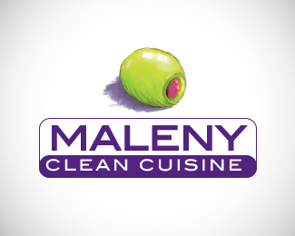
Maleny Clean Cuisine
by acedesign • Uploaded: Apr. 01 '08

Float
(Floaters:
0 )
Description:
looking for some comments for this logo it is being designed for a classy cuisine food company
Status:
Nothing set
Viewed:
1396
Share:


Lets Discuss
I prefer this one of the three. You might want to experiment with a different type for %22maleny%22. Some sort of script font might do a better job of conveying classiness.
Replyhey thanks for the advice, ill post the new one.
ReplyI like the illustration of this above all the others (including the chefs hat), but the choice for colour and style of type is letting this one down. **I think a nice serif, script or even better, a handwritten cursive would complement the sketchy illustration a lot better. IMO
Replythanks for the great advice. I'll change it for my own satisfaction but the client wants to head a completely different direction. So here we go again!!
ReplyPlease login/signup to make a comment, registration is easy