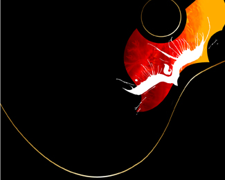
Quill Rose
by acedesign • Uploaded: Mar. 30 '08

Float
(Floaters:
0 )
Description:
logo designed for a young illustrator, anyone got any recommendations for improving the typography?
Status:
Nothing set
Viewed:
2312
Share:


Lets Discuss
I think you could reduce the size of the feather/Pen and make %22rose%22 larger...I think that would bring a little more balance to the piece.%0D*%0D*Also, the reflection is distracting...maybe reduce the opacity to 20%25
ReplyThanks, i agree with you completely.*
ReplyPlease login/signup to make a comment, registration is easy