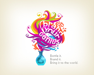
Description:
I`m happy to announce that this is a first project completed with a new force on board. I`ve hired some pretty talented, well educated, younger local girl. More info to come soon.
As seen on:
www.wizemark.com
Status:
Client work
Viewed:
42656
Share:



Lets Discuss
Groovy
Replyyeah. pretty cool.
Replytalent shows
Replycool n different..
Replycool and fresh! congrats for your well taken decission.
ReplyYouve got yourself a winner. Very nice!
Replyhot
Replywow I really love this one!! great work!!
Replyyup, this looks great. congrats!
Replyyou da man!
Replyawesome crazy beautiful thing
Replyhaha. some younger local girl
Reply%5EC%60mon, guys.. :) Professional all the way.. :) Thanks for the comments, all!
ReplyThis is a logo or color palette?
Reply%5E This is a logo with beautiful color palette. Damn this is hot work.
Replyis she pretty as well? we got the young part. :D
Reply%5EShe%60s pretty and hot and i%60m proposing my gf several options at the moment. :D Thanks, Milosz
ReplyI don't know anything about your lady friend, but I know this design is looking mighty fine.
ReplyWIZELY done : )
Replyis it vector?
ReplyExcellent work!
ReplyThanks a lot, fellaz! *@7gone Of course.
ReplyCool!
Replyvery good, should look great on a t shirt
ReplyGenius!
Replybeautiful work. love the colors. fun design.
Replytoo busy IMO.
Reply%5EIMO 2 :). But: 1. that level of complexity was requested, 2. this design will be on a business cards (surprisingly legible on a 90x50 canvas) and on a site only, 3. %60sucked in%60 darker part inside the bottle also creates an G which is going to be used for the situations when and/or if needed (maybe a favicon for example, etc) and 4. we%60ve agreed that we%60ll make a simplified version as well down the road. *Thanks for the comments, all!
Replyvery catchy and colorful :)
Replybusy but beautiful**
ReplyFantastical, colourfull, and beautyfull logo!
ReplyThis is really awesome, Srdjan :D
ReplySuperb!
Replywowable piece of logo design!
ReplyThank you, guys! Glad you, all, find this interesting. Just finished business cards.. :)
ReplyThat girl's got some skill!
ReplyI wouldn't know where to start if I was designing this.
ReplyDon't see any idea in this work! :( sorry.
ReplyFab, definitely. :)*Roy, lol. We started with the pen %26 paper, nailed down the line work and than i%60ve started up the Illustrator and played around with the colors %26 effects.. The trickiest part was to get the basic shapes and the curves from the sketch..
ReplyIt%60s ok, Pero. :)
Reply@Wize: I didn't courage to my friend. %3B)
Replypowerful
ReplyWow, amazing Wizemark!!
ReplyThanks, guys. Appreciate your comments.
ReplyIs there supposed to be a hint of a ying/yang in the middle of the tornado..the blue/white?
ReplyYep. Nice catch, Matt. :)
ReplyFresh!
ReplyWoW. Breathtaking.
Replyinspirating twirl of dynamics %3D)
ReplyFeel fresh and good
Replyreallyy coollll!!!
Replywow....fantastic....:) love it and faved!
Replylike the energy
Replyhttp://www.logodesignavenue.com/logo-design/
ReplyThanks, guys. Appreciate it, Mike.
Replypretty cool.
ReplyPlease login/signup to make a comment, registration is easy