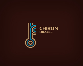
Description:
logo design for an astrology consultant company (astrology counselling, psychotherapy for individuals, couples and families, etc). Chiron is a comet and plays big part in our life according to astrology. Chiron`s symbol is a key, symbolically representing an missing element for personal healing, learning and growth. Half of an O makes perfect C, once key has been found person `becomes` full circle (perfection).
As seen on:
www.wizemark.com
Status:
Client work
Viewed:
26278
Share:


Lets Discuss
This is incredible!
ReplyThanks, Chris.
Replygreat mark Srdjan!
ReplyThanks, Ivan.
ReplyUpdate: final and approved.
ReplyWow - king lines %26 colors
ReplyGreat key design!!!
ReplyGreat Design!
Replythanks, guys! appreciate the gallery spot too..
ReplyYeah, great concept Srdjan..Congrats on the approval.
Replygreat stuff, man.
ReplyHey Srdjan, that color palette looks awfully familar :P Nice stuff man.
Replyintelligent stuff... I really love this .
Replylike wr it went..cherz Srdjan
Replykeyp it up, great job :)
ReplyThanks so much, all! Joe, ye, one you%60re referring to was main direction/requested reference in the brief (colors and overall look %26 feel).. :)
ReplyClever!!
ReplyGreat colors. Very elegant.
ReplyThanks, Pierro and Draward.
Replycolour combo is very fresh
ReplyGreat Concept..... Good job
Replynice work, love the colors
ReplyNice work
ReplyPlease login/signup to make a comment, registration is easy