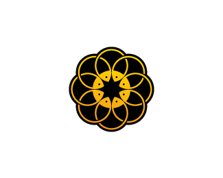
Description:
3rd and last concept. concept #1 | concept #2
As seen on:
www.wizemark.com
Status:
Work in progress
Viewed:
4199
Share:



Lets Discuss
Dig this a lot!
ReplyThanks, dude!
Reply%26 really cool one..
ReplyThis is really nice Srdjan. Maybe it would be stronger without the black background on it...really bring out the fish.
ReplyThanks, fellas.*I hear you Joe and brandsirrah. I guess that there%60s a space for an improvement here, but this project got stalled a bit and i think that client is aiming for some of the other concepts to be retouched a bit. Btw, black backdrop was placed there as this was meant to be printed on the jars as well.
ReplyPlease login/signup to make a comment, registration is easy