Blue Water
by VERG • Uploaded: Feb. 01 '17 - Gallerized: Feb. '17
Description:
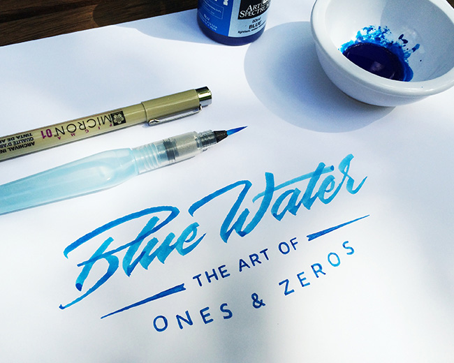
A logo I designed for a digital agency. We ended up going a different direction in the end which makes this logo one of my most favourite used concepts. Designed with Blue Water.
As seen on:
VERG
Status:
Unused proposal
Viewed:
3,770
Tags:
blue
•
lettering
•
water
•
ink
Share:
Lets Discuss
This one looks very nice, but I think the bottom line text would look better if it was texted (bended) on the arc.
Replythis lettering is awesome. love it!
Reply@xDick Cheers mate. This was a fun concept to execute.
ReplySick lettering!
Reply@canhur Thank you kindly.
ReplyPlease login/signup to make a comment, registration is easy