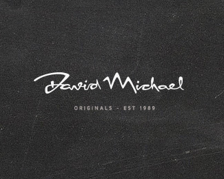
Description:
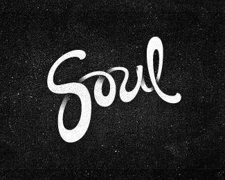
For a client that required a signature logo. This was the edgier approach. Mountains and waves incorporated into the letters.
As seen on:
VERG
Status:
Work in progress
Viewed:
31935
Share:


Lets Discuss
I like this one better. Looks more original with unusual unique type.
ReplyAmazing mark, I love this flow of master's pen
ReplyLuka and Alena... thank you for the kind words.
ReplyVery unique style of script, Matt. Well done. Has the client made his decision yet?
Replythanks Nick! appreciate the comment. to answer your question%3B yes! and low and behold it's this one! So it's a nice and fitting ending for it to be gallerized. thanks LP! legends!!
ReplySolid, unique script, Matt. love it! Has some real life to it.
ReplyLove the type. It's got lots of character!
Replybeautiful work Matt!
Replythank you kind people. stoked you like!!!
ReplyVery nice Matt..
ReplyVery nice type! Love it!
ReplyCheers champs!
ReplyPlease login/signup to make a comment, registration is easy