Description:
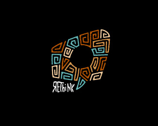
Group discussions on topics by leading thinkers. the idea behind the swirly lines is to represent different moments of conversation by individuals and the ever changing flow of conversation that occurs. the circle in the middle is the common topic which conversation [loosely] revolves around.
Status:
Work in progress
Viewed:
13111
Share:

Lets Discuss
float and fav ... as I said before ... never seen a piece like that ... mega awesomeness !!!
Replyyou're a legend mate, thanks heaps. as mentioned also, really stoked you like. I've just updated it and brought the size of the mark down - i think it looks better now. thoughts?
Replyyou can change it every day a bit ... but you can not make it better ... IMO ...
Replythanks mate... in that case, it's back to the original.
Replytried to say ... whatever you do ... it remains top notch work ... imo ingenious stuff ... logo of the year *regarding concept, style and execution ...
Replyyou're too kind mate... i really appreciate your comments.
ReplyI really like the look of this but I can't help seeing a skull there. And the speech bubble shape gets a little lost with the type where it is, though it does fit beautifully. Great, regardless.
Replythanks sam, really appreciate your feedback and comments - interesting you see a skull, i didn't see that coming. i wonder whether the white background version would do the same for you.
Replycool style love it
Replycheers matti!
Replyyeah, love the styling.
Replylovely:)
ReplyNice one Matt. Congrats!
Replythank you all for the great comments... and thank you logopond - it really makes my day to see one of my little babies on the front page. cheers!
Replycongrats Matt ....
ReplyThanks buddy! And thanks again for your previous comments.
ReplyVery nice approach - different. Like it!
Replyethnic beauty)
Replygood style :)
Replylove the colour palette of this one
Replythank you friends... really happy about everything you've said. thanks a mil
Replyit looks quite prehispanic to me, great logo!
Replyinteresting... i really love hearing insights into what other people see. thanks heaps for the comment.
Replymatt, this is innovative. and it still holds true to your style. love it.
Replycheers colin! really stoked you like. this is another one of those marks where the right side of the brain took over when chatting about the requirement over the phone, just subconsciously doodling away. i love the outcomes and rawness of doodling.
Replycoo!
ReplyCheers adder!
ReplyI have seen some kind of skull... with the swirls as a brain. Naturally thats on topic. Well done!
Replycorrect about the swirls - still not seeing the skull though, but i was one of the minority that could never see the image in those 3d posters anyway. thanks for the feedback mate.
ReplyGreat job. Very unique work.
Replythanks a million nick!
Replyhave you ever being to Panama? awesome, by the way...
ReplyThanks wara. Havn't been to panama. Would love to go though, maybe one day on a surf trip through central America.
Replygreat!!!
ReplyThank you, Hache.
ReplyLove this! great color palette on the black color buddy!
Replywhy thank you kind sir!
ReplyPlease login/signup to make a comment, registration is easy