Description:
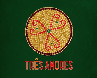
An idea i'm playing around with for a portuguese restaurant. the name will probably change.
Status:
Just for fun
Viewed:
3108
Share:


Lets Discuss
Yes. I got in first! Looking good, Matty! :-)
ReplyLove the 3 hearts - the Portuguese do love their food!
ReplyI love the name - perfect fit with the logo. Makes me think that the restaurant's a family-run concern with 3 generations working together.
Reply3 hearts, 3 comments, 3... it's the magic number! thanks heaps mate, and thank you also for the feedback, steering me clear of the original type layout with the swirly swirls was a good option.
ReplyLovely mosaic style!
ReplyCheers Gert! i decided to create each tile individually instead of being lazy and duplicating any of the sections.
ReplyI can almost smell the food...love this
Replythanks Inciler. Nothing makes my mouth water more then feijoada.
ReplyPlease login/signup to make a comment, registration is easy