Description:
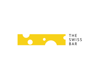
Experiment. Mark shows a horizontal bar that presents a good lounge atmosphere (champagne bubbles in the air) but also a symbol of the Swiss heritage (cheese).
Status:
Just for fun
Viewed:
15932
Share:
Lets Discuss
Fun stuff Alen! %3B)
ReplyJust spoke with few Ponders offline, I would love to do the whole branding system for this baby! Thanks neighbor! %3B)
Replysay cheese :D
ReplyC yah in the bar buddyamer! %3B)
Replylittle cheesy, but fun. (kidding about the too cheesy part.) very cool concept.
ReplyCHEEEEEEEESE :D*very sweeet looking.
Replyvery strong!**
ReplyMikey, K and Big, thanks peeps, glad yah like it!
ReplyAwesome.
ReplyThanks, Sean!
ReplyHa! Nice one Alen!
ReplyHeh, thanks Bojan! As a matter of fact, I am negotiating an interior design project for a new lounge bar here in Croatia, I showed this experimental brand to my client and they totally love it !!! It's a 99 percent chance that we will develop this further using it as an inspiration for the interior design guidelines as well !!! So excited! :) :) Now, there's always a client's 'wife' somewhere who's 1 percent vote can get megaloud, you know how it goes...
ReplyYikes, i know :) Good luck! Keep us posted!
Replymodern %26 simple - NICE
Replygreat logo Alen!
ReplyBojan, thanks, I will! :)*Ashley and Konrad, thanks peeps!
ReplyJUST AMAZING... that is all. **Check out some of my stuff if you's like:**http://logopond.com/members/profile/showcase/31066
ReplyThanks Blake, show us more! :)
ReplyGreat stuff, you could develop a whole series, edam, brie :) In all seriousness, nice work!
ReplyVery funny and at the same time extremely professional and beautiful.
ReplyMym and Know, thank you very much!
ReplyTotally awesome!
ReplyClever %26 minimalistic%3B)
ReplyPetar and Four Plus, thanks!
ReplyThanks Bram! In a way yes, it stands for everything that's Swiss :)
Reply%5EI disagree.*I haven't commented on this one before Alen, but objectively and subjectively this concept/execution is fantastic. My kind of logo, very brand-able. *Any updates with this project Alen? When and where can I get a pot of fondue? :)
ReplyThanks Bram, I respect your opinion :)*Rocky, this is the short version of the story. There was investor that came back to our town after working for 25 year in Switzerland. Nostalgic as they usually get, he wanted to open up a bar that would be swiss themed and I found it to be a very inspirational idea. When I presented this concept of how to approach the visual identity he instantly fell in love with it (you'll see a part of this story in the comments above). Everything was set and ready to go but right at the end of the project he got a new job offer back there that he just couldn't resist accepting. We stayed in touch though, all peaches and cream for them at the moment and the deal is to finish this once they get back again (probably within the next 5 years). So it's stand-by status for now! :)
ReplyCool, I like this minimal approach!
ReplyThanks Simpatix! I've recently discovered this branding project: www.logo-designer.co/new-zealand-cheese-school-identity/
ReplyPlease login/signup to make a comment, registration is easy